Docusaurus made with Tailwind CSS and shadcn/ui

In this blog post, I will share how to create a Docusaurus 3.8 site using Tailwind CSS 4 and shadcn/ui components.
Start by creating a new Docusaurus site:
npx create-docusaurus@latest --typescript my-website classic
cd my-website
npm start
Tailwind CSS
Now, let's install Tailwind CSS as a PostCSS plugin: https://tailwindcss.com/docs/installation/using-postcss
To make Tailwind CSS work with Docusaurus you need to import Tailwind CSS the following way:
@import 'tailwindcss';
@layer theme, base, components, utilities;
@import 'tailwindcss/theme.css' layer(theme) important;
@import 'tailwindcss/preflight.css' layer(base) important;
@import 'tailwindcss/utilities.css' layer(utilities) important;
Create the following plugin for PostCSS:
module.exports = function tailwindPlugin(context, options) {
  return {
    name: 'tailwind-plugin',
    configurePostCss(postcssOptions) {
      postcssOptions.plugins = [require('@tailwindcss/postcss')]
      return postcssOptions
    }
  }
}
Enable the plugin in the Docusaurus config:
export default {
  plugins: [
    ['./src/plugins/tailwind-plugin.js', {}],
  ]
};
In case of CSS build errors disable the useCssCascadeLayers option in the
Docusaurus config. The CSS Cascade Layers plugin will be
introduced in Docusaurus v4 and comes with pre-configured CSS layers:
export default {
  future: {
    v4: {
      useCssCascadeLayers: false,
    }
  }
}
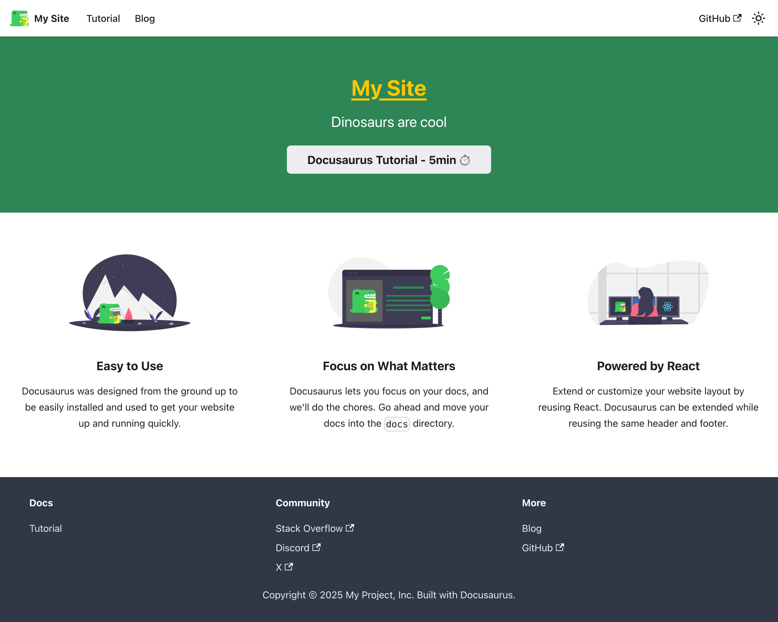
Now it's time to test if Tailwind CSS is working. Let's change the size and color of the title on the homepage:
<Heading as="h1" className="text-4xl font-bold underline text-yellow-400">
  {siteConfig.title}
</Heading>
Your homepage should now look like this:
Install a Prettier plugin for Tailwind CSS that automatically sorts classes:
npm install -D prettier prettier-plugin-tailwindcss
shadcn/ui
To install Shadcn UI follow the steps mentioned on the Manual Installation page.
The path aliases in tsconfig.json must be:
{
  "compilerOptions": {
    "baseUrl": ".",
    "paths": {
      "@/*": ["./src/*"]
    }
  }
}
Update the Tailwind CSS file name in components.json:
{
  "tailwind": {
    "css": "src/css/custom.css"
  }
}
If you are done you should be able to install shadcn/ui components:
npx shadcn@latest add button input label textarea
Add the path alias to the Docusaurus webpack config:
const path = require('path')

export default {
  plugins: [
    function webpackAliasPlugin() {
      return {
        name: 'webpack-alias-plugin',
        configureWebpack() {
          return {
            resolve: {
              alias: {
                '@': path.resolve(__dirname, 'src')
              }
            }
          }
        }
      }
    }
  ]
};
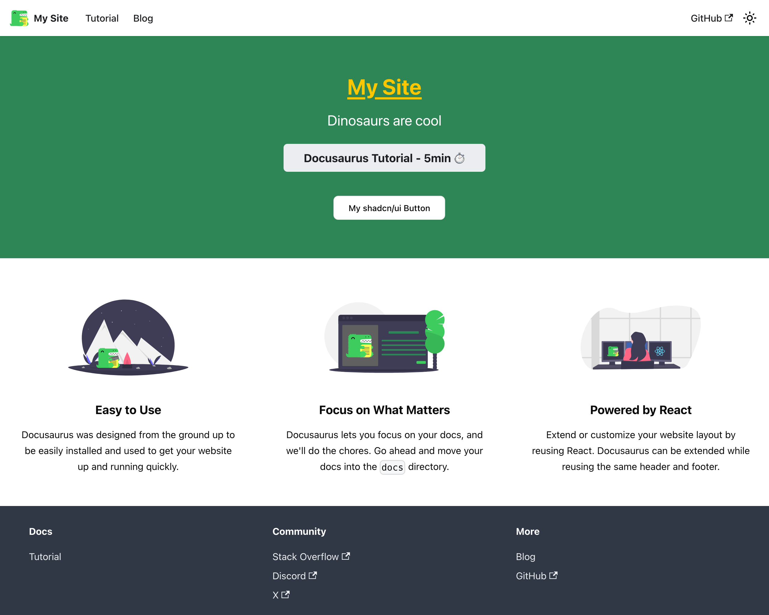
Let's add a button to the homepage:
import { Button } from '@/components/ui/button'

<div className="mt-10">
  <Button variant="outline" size="lg">
      My shadcn/ui Button
  </Button>
</div>
You're Docusaurus page should now look like this:
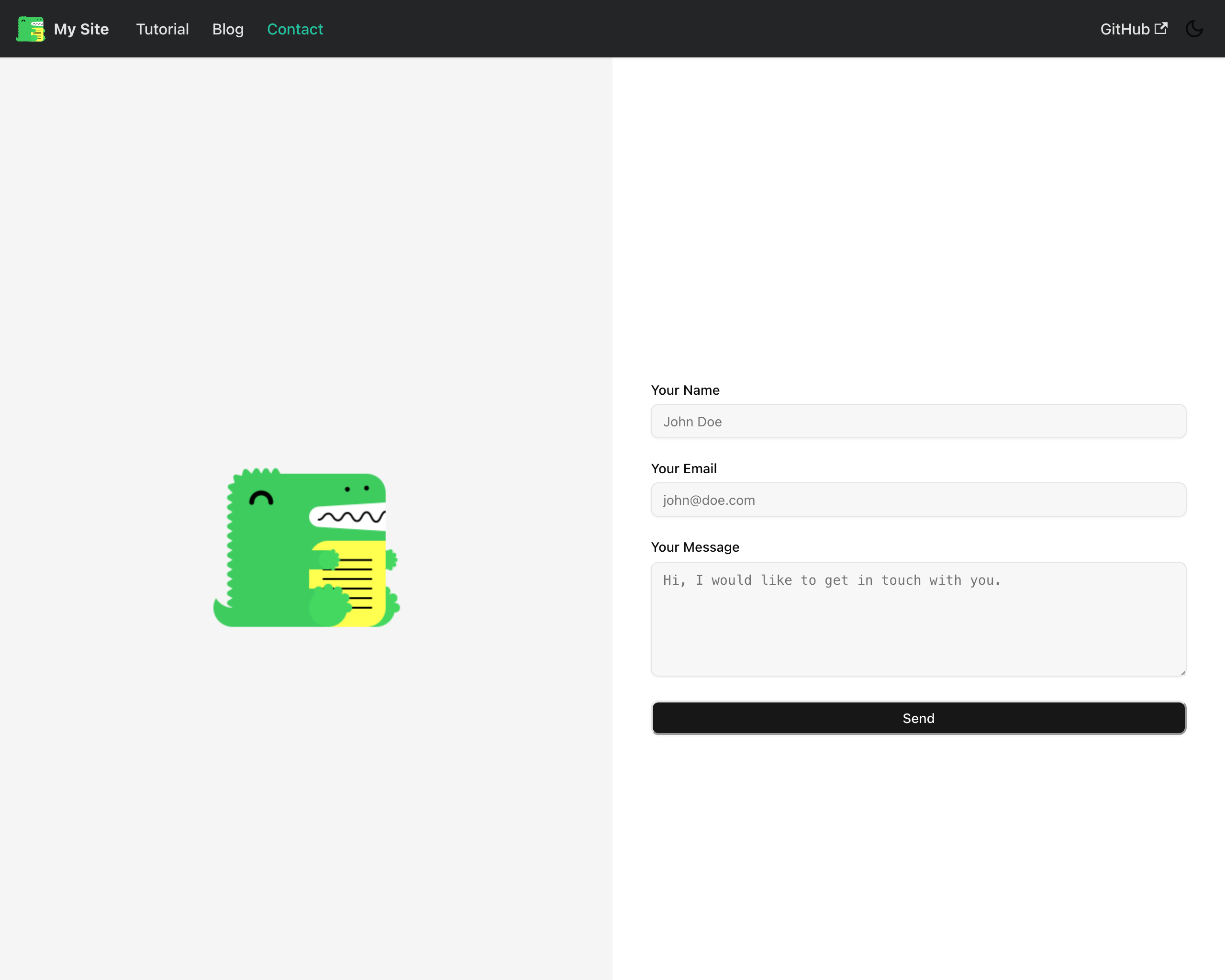
Contact Form
Let's use the new shadncn/ui components to create a simple contact form. One of the nice things of Docusaurus is that you can create custom React pages, which gives you a lot of flexibility.
First, create a file src/pages/contact.js with the following content:
import React, { useState } from 'react'
import Layout from '@theme/Layout'

export default function ContactForm({ className = '', ...props }) {
  async function onSubmit(e) {
    e.preventDefault()
    // handle the form submission
  }

  return (
    <Layout title="Contact" description="Contact form">
      <form onSubmit={onSubmit} noValidate className="content-center">
        ...
      </form>
    </Layout>
  )
}
Add a nabvar item for the contact form in the Docusaurus config:
export default {
  themeConfig:
  ({
    navbar: {
      items: [
        {
          to: '/blog',
          label: 'Blog',
          position: 'left'
        },
        {
          to: '/contact',
          label: 'Contact',
          position: 'left'
        },
        ...
      ],
    },
Now, it's time to use the shadcn/ui components we just installed. Let's add a label and input component to the form:
import { Input } from '@/components/ui/input'
import { Label } from '@/components/ui/label'

const [values, setValues] = useState({ name: '' })
const [errors, setErrors] = useState({ name: '' })

<form ...>
  <Label htmlFor="name">Your Name</Label>
  <Input id="name" placeholder="John Doe" value={values.name} aria-invalid={!!errors.name} />
  {errors.name && <p className="text-xs text-destructive">{errors.name}</p>}
</form>
You can repeat the same for email and message fields. Finally, add a submit button and you're done. Here's the complete code for the contact form:
import React, {useState} from 'react'
import Layout from '@theme/Layout'
import {Button} from '@/components/ui/button'
import {Input} from '@/components/ui/input'
import {Label} from '@/components/ui/label'
import {Textarea} from '@/components/ui/textarea'

export default function ContactForm({className = '', ...props}) {
    const [values, setValues] = useState({name: '', email: '', message: ''})
    const [errors, setErrors] = useState({name: '', email: '', message: ''})

    async function onSubmit(e) {
        e.preventDefault()
        // handle the form submission
    }

    return (
        <Layout title="Contact" description="Contact form">
            <div className='flex h-full min-w-sm flex-col bg-white'>
                <div className='grid h-full grid-cols-1 p-0 lg:grid-cols-2'>

                    <div className={'bg-accent sticky h-screen content-center hidden lg:block'}>
                        <div className={`flex justify-center`}>
                            <img alt='Docusaurus'
                                loading='lazy'
                                decoding='async'
                                className={'block max-w-[500px]'}
                                src='/img/docusaurus.png'/>
                        </div>
                    </div>

                    <div className={'m-10 content-center'}>
                        <form onSubmit={onSubmit} noValidate>
                            <div className={'grid gap-2 mt-6'}>
                                <Label htmlFor='name'>Your Name</Label>
                                <Input
                                    id='name'
                                    placeholder='John Doe'
                                    value={values.name}
                                    aria-invalid={!!errors.name}
                                />
                                {errors.name && <p
                                    className='text-destructive text-xs'>{errors.name}</p>}
                            </div>
                            <div className={'grid mt-6 gap-2'}>
                                <Label htmlFor='email'>Your Email</Label>
                                <Input
                                    id='email'
                                    type='email'
                                    placeholder='john@doe.com'
                                    value={values.email}
                                    aria-invalid={!!errors.email}
                                />
                                {errors.email && <p
                                    className='text-destructive text-xs'>{errors.email}</p>}
                            </div>
                            <div className={'grid mt-6 gap-2'}>
                                <Label htmlFor='message'>Your Message</Label>
                                <Textarea
                                    id='message'
                                    rows={4}
                                    placeholder='Hi, I would like to get in touch with you.'
                                    className='min-h-[120px]'
                                    value={values.message}
                                    aria-invalid={!!errors.message}
                                />
                                {errors.message && <p
                                    className='text-destructive text-xs'>{errors.message}</p>}
                            </div>
                            <Button type='submit' className='w-full mt-6'>Send</Button>
                        </form>
                    </div>
                </div>
            </div>
        </Layout>
    )
}
And that's it! You now have a Docusaurus site with Tailwind CSS and shadcn/ui components.
Check out the blog post Building API Documentation with Docusaurus to see how to create API documentation with Docusaurus and OpenAPI.